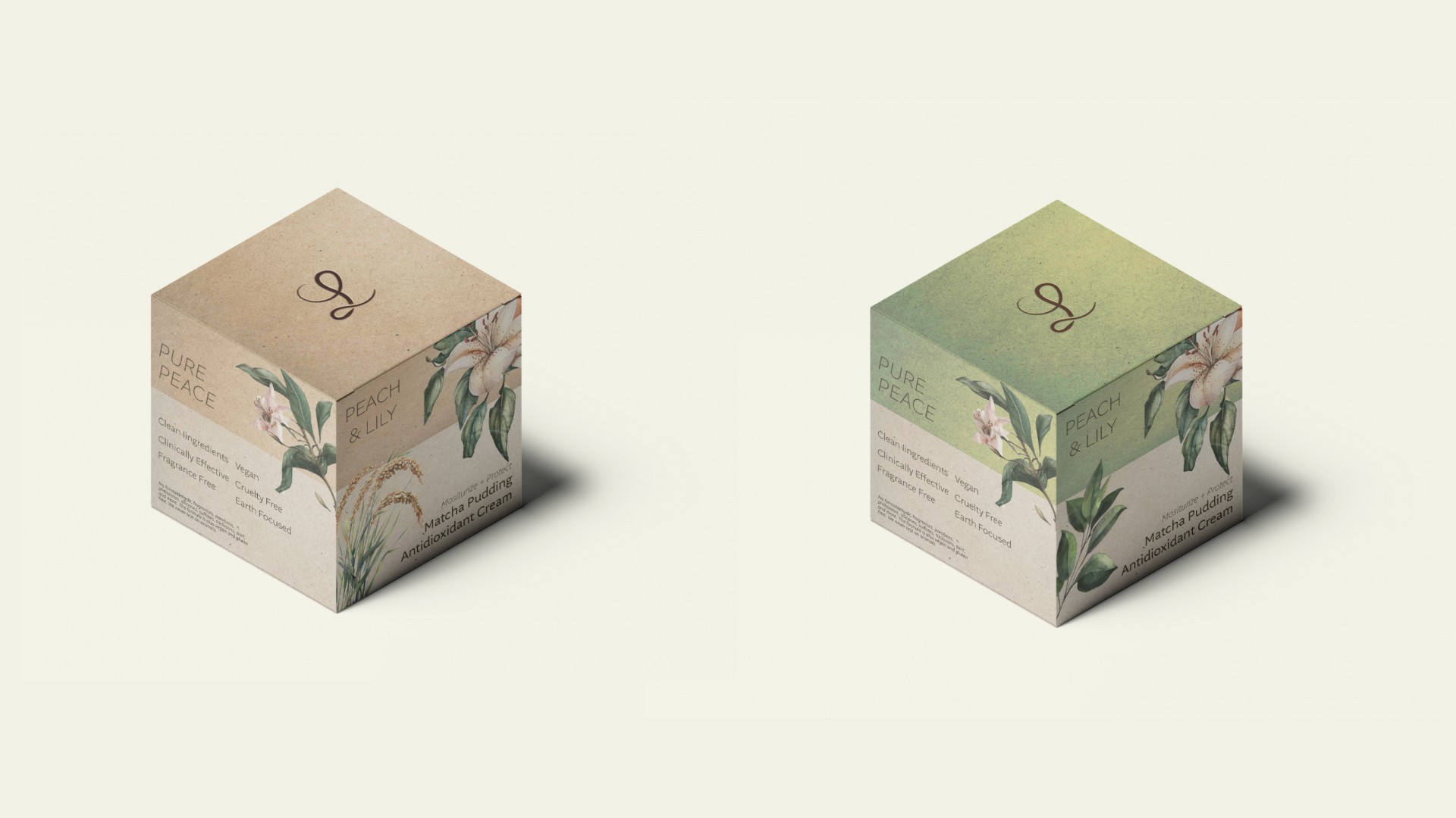
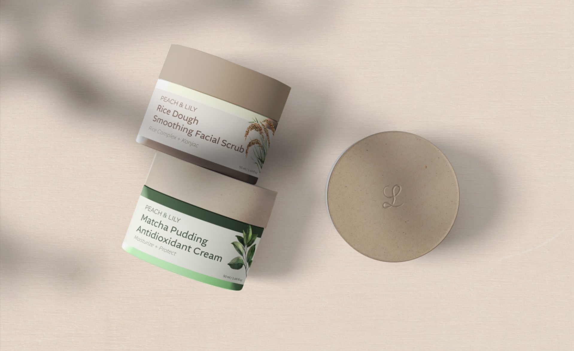
Peach & Lily is a skincare brand known for pioneering Korean beauty (K-beauty) in the United States. Founded by Alicia Yoon in 2012, it emphasizes high-quality, effective skincare products with a focus on natural ingredients and innovative formulas. The brand offers a range of products from cleansers and serums to masks and moisturizers, designed to address various skin concerns such as acne, hydration, anti-aging, and sensitivity. Peach & Lily is recognized for its clean beauty commitment, ensuring its products are free from harsh chemicals, and has developed a loyal following for its transparent, results-driven approach to skincare.
Role:
Brand Designer
Industry:
Skincare/ Beauty
Duration:
1 week
Challenges
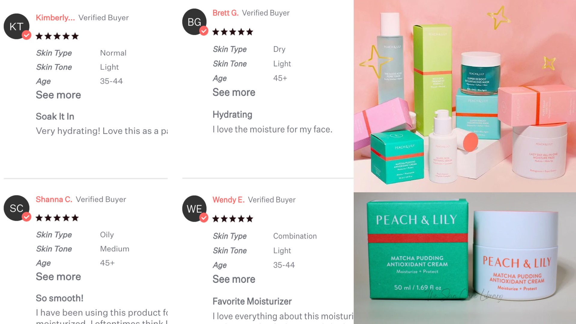
The current challenge with Peach & Lily’s branding is that, while its visuals are young and vibrant, using bright hot pink tones and playful icons, the brand's primary audience is largely over 40. The current look doesn’t fully resonate with the brand’s commitment to environmental care and sensitive skin, which could be better communicated with an elegant, organic aesthetic. The redesign aims to create a refined, sophisticated look that better aligns with its values and audience, emphasizing natural, gentle qualities that appeal to a mature demographic.
My Approach
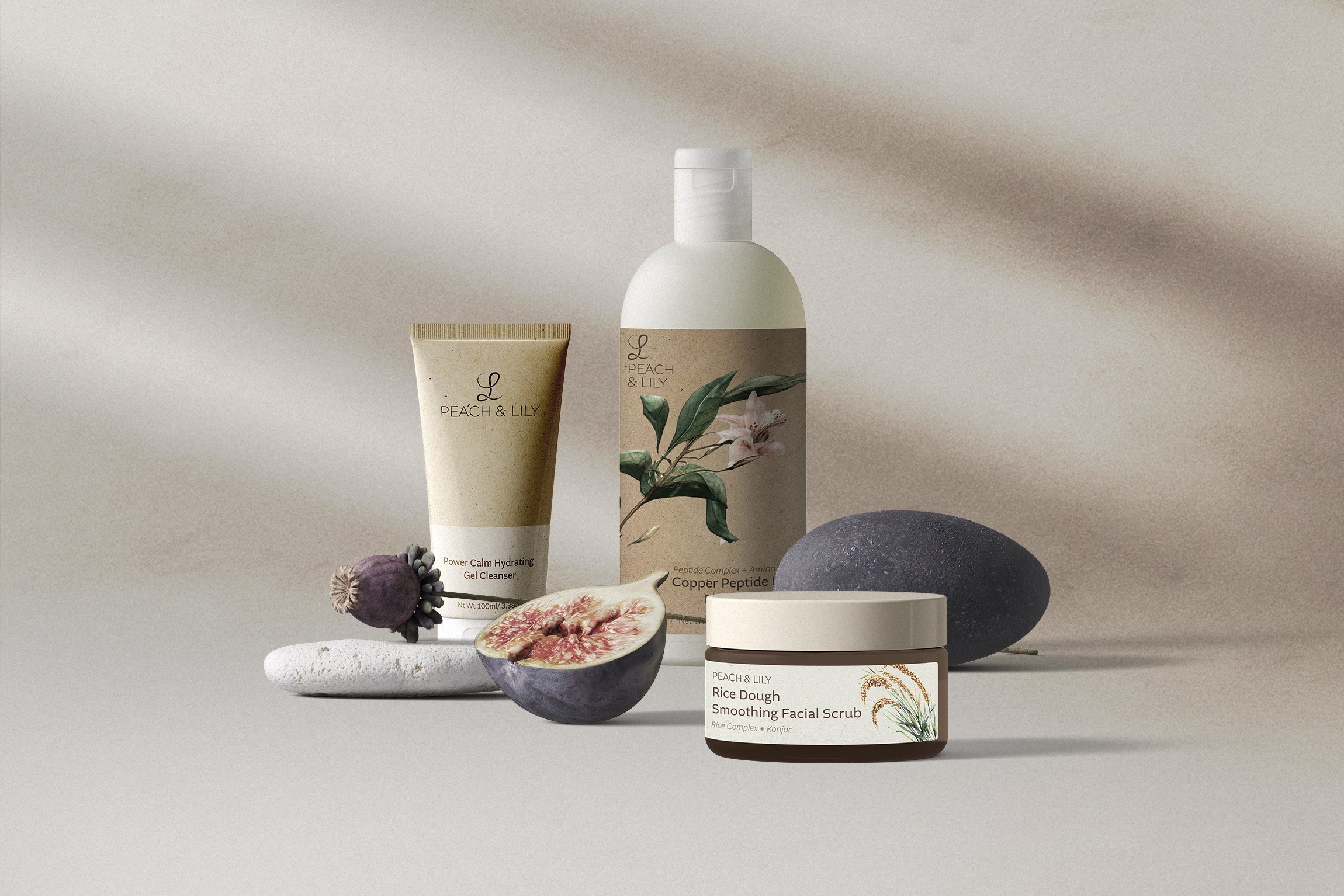
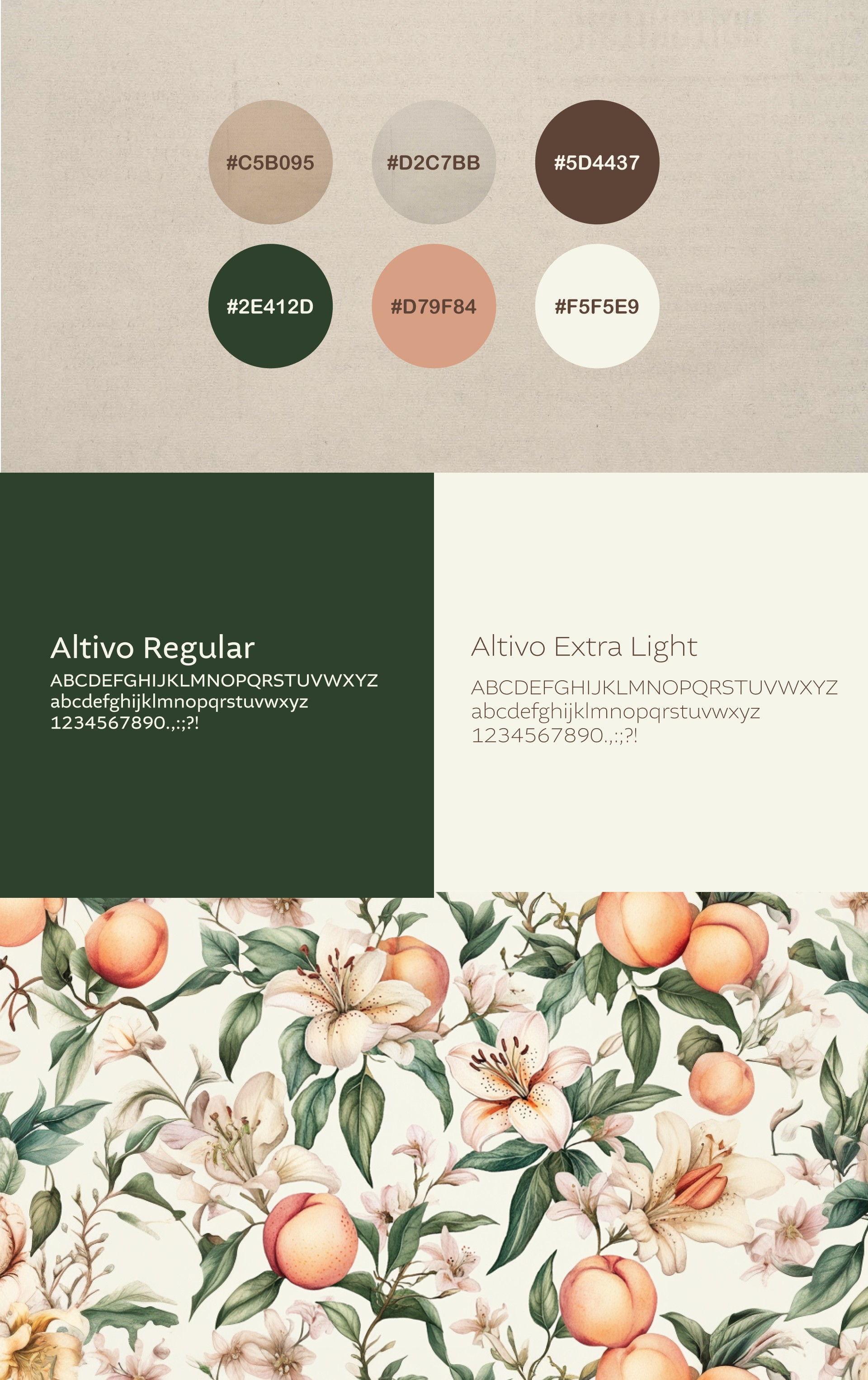
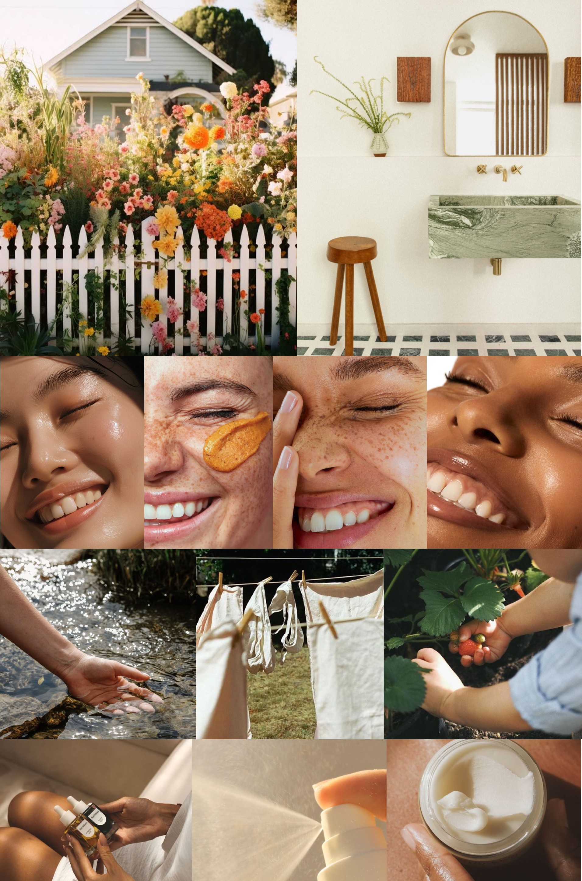
To highlight Peach & Lily's commitment to "clean beauty," I’m creating a refreshed visual identity that embraces textured, natural materials and an earthy, organic color palette. Using textured paper brings a tactile, refined feel to the brand's packaging and print elements, which subtly conveys quality and care for the environment. This textural approach, combined with soft, plant-inspired tones, evokes a sense of purity and wellness that aligns with the brand's dedication to sensitive skin and environmentally friendly practices. The overall design will communicate elegance and authenticity, building a connection that resonates deeply with its 40+ audience.
To highlight Peach & Lily's commitment to "clean beauty," I’m creating a refreshed visual identity that embraces textured, natural materials and an earthy, organic color palette. Using textured paper brings a tactile, refined feel to the brand's packaging and print elements, which subtly conveys quality and care for the environment. This textural approach, combined with soft, plant-inspired tones, evokes a sense of purity and wellness that aligns with the brand's dedication to sensitive skin and environmentally friendly practices. The overall design will communicate elegance and authenticity, building a connection that resonates deeply with its 40+ audience.
Result
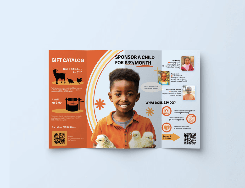
For this project, I designed a pamphlet for World Vision to raise awareness and encourage donations through their 'Sponsor a Child' program and 'Gift Catalog.' The design combines clear information and empathetic visuals, showcasing the positive impact of donations. By using Adobe Firefly and Photoshop, I created before-and-after scenes to highlight how contributions can transform the lives of children in vulnerable regions.
