
Peach & Lily is a skincare brand known for pioneering Korean beauty (K-beauty) in the United States. Founded by Alicia Yoon in 2012, it emphasizes high-quality, effective skincare products with a focus on natural ingredients and innovative formulas.
The brand offers a range of products from cleansers and serums to masks and moisturizers, designed to address various skin concerns such as acne, hydration, anti-aging, and sensitivity.
Peach & Lily is recognized for its clean beauty commitment, ensuring its products are free from harsh chemicals, and has developed a loyal following for its transparent, results-driven approach to skincare.
Categories: Skin Care
Tools: Photoshop | Illustrator | Figma | Midjourney

Problems to be solved

The brand's primary audience is over 40, and the current branding doesn't resonate with them.
The current look doesn't communicate the brand’s commitment to environmental care and sensitive skin.
Process & Iterations
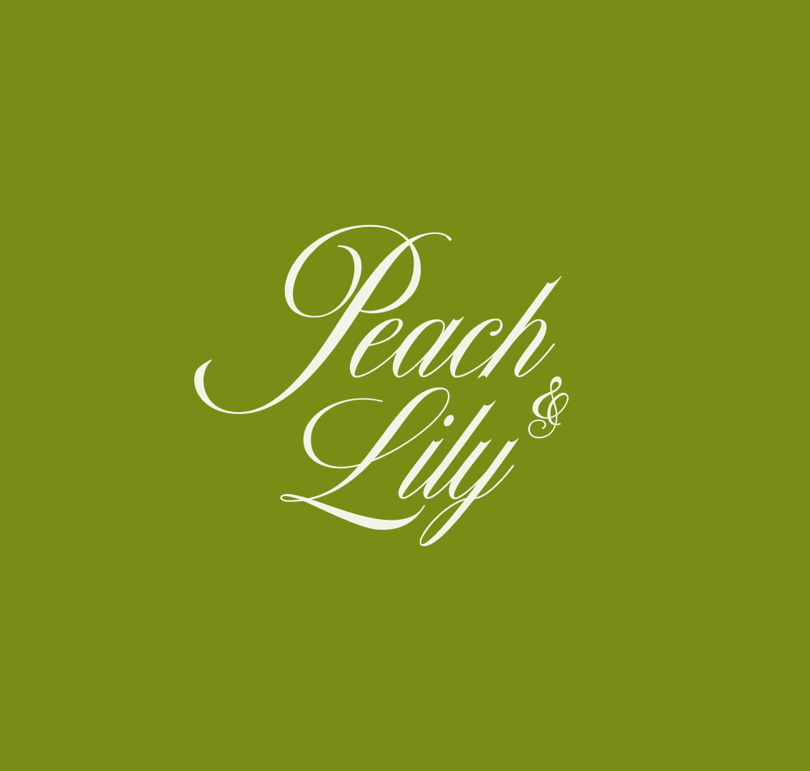
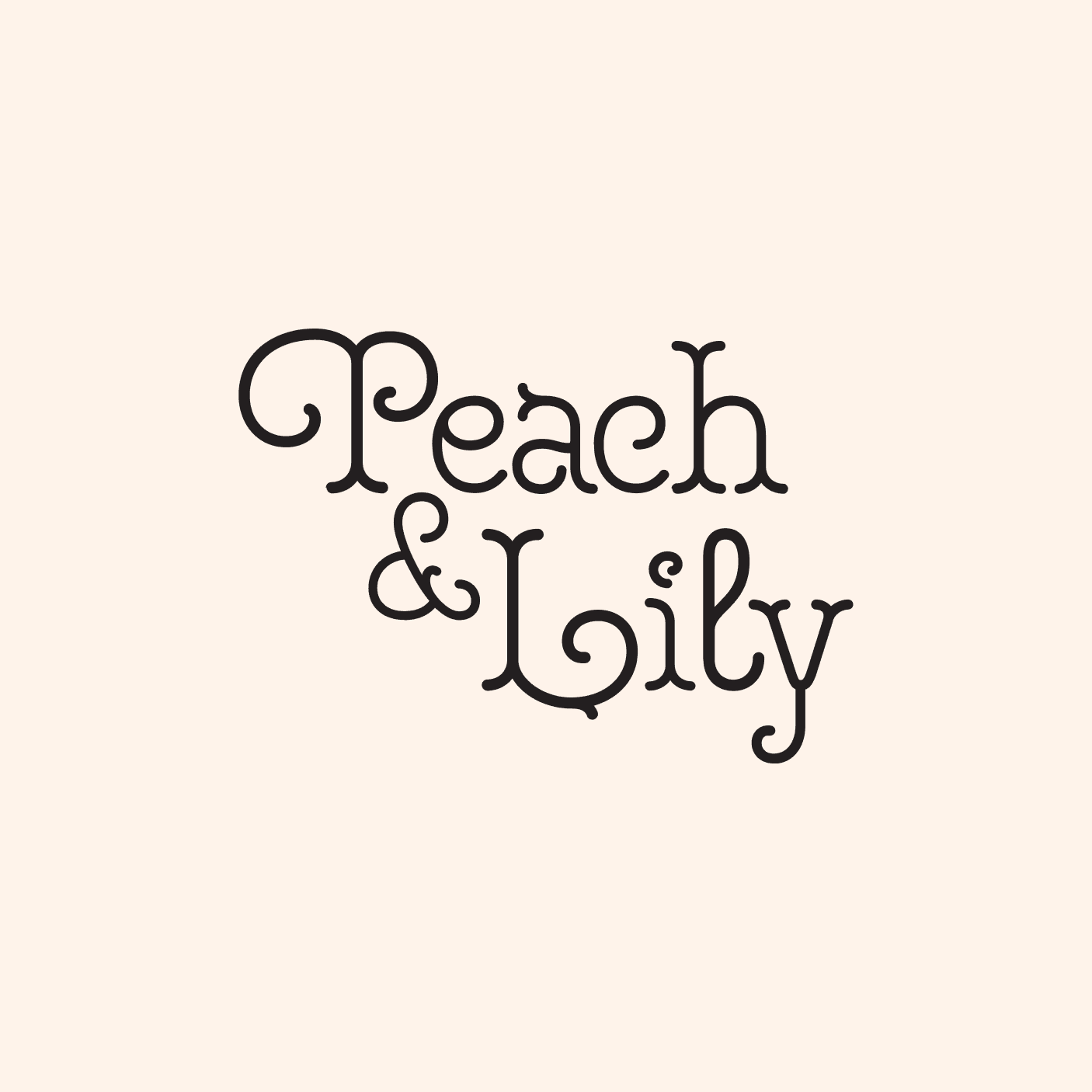
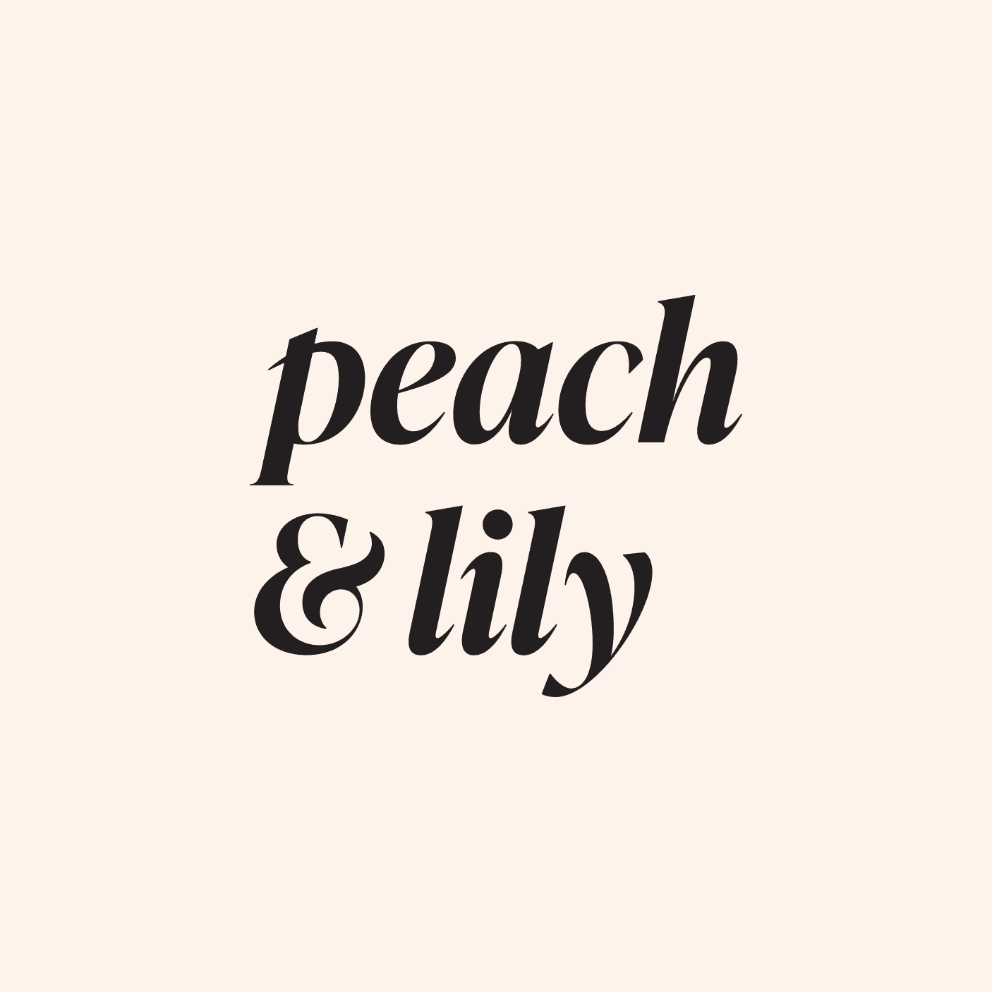
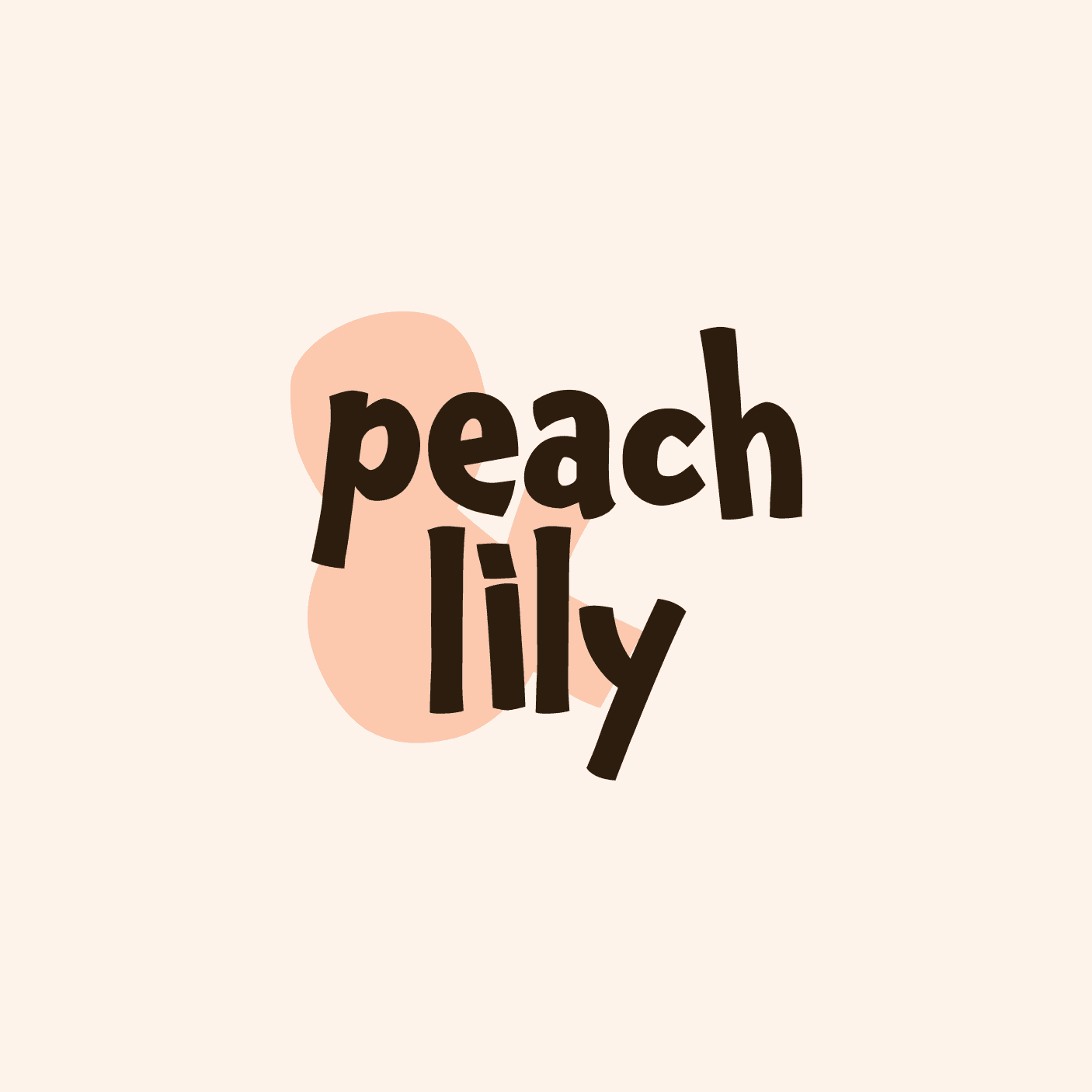
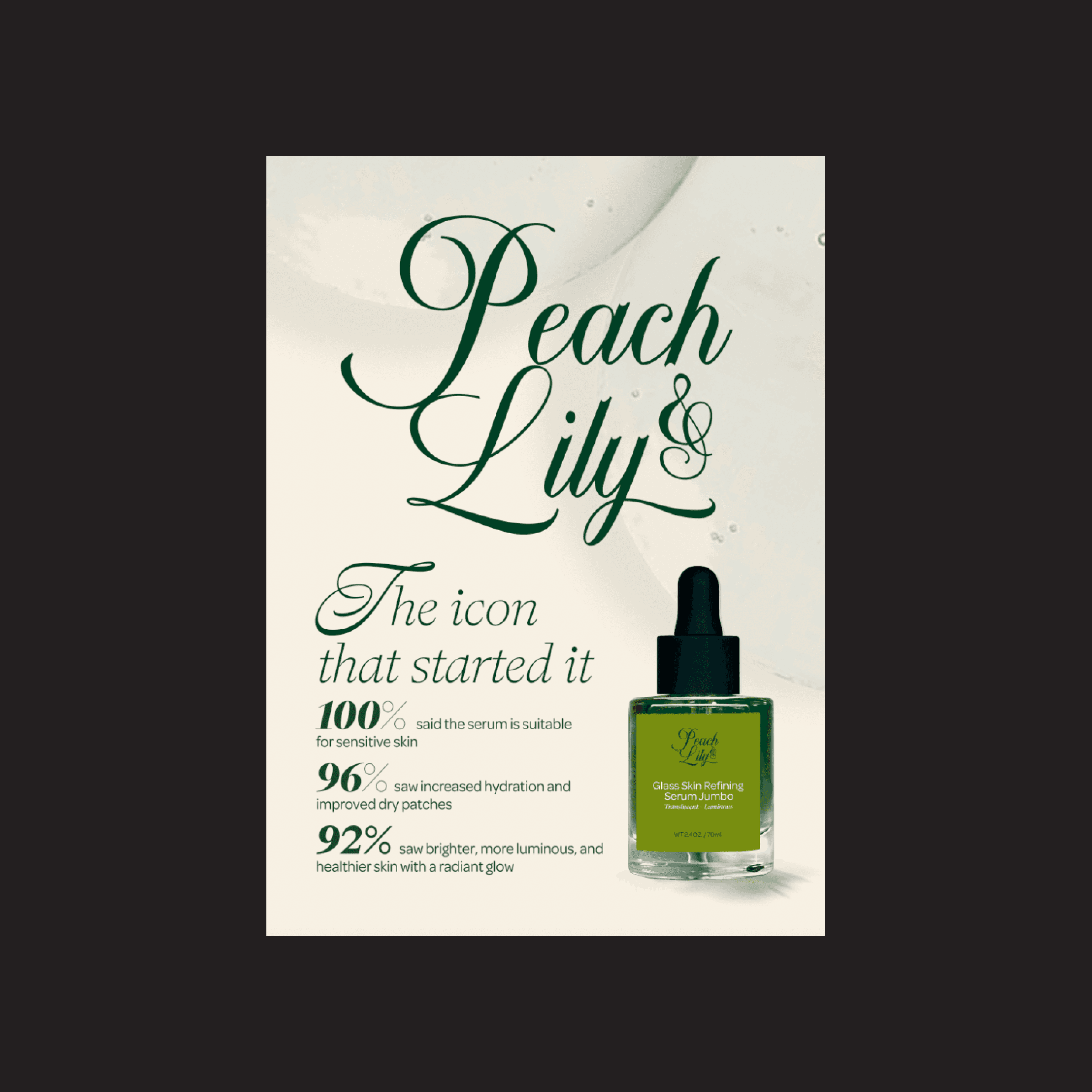
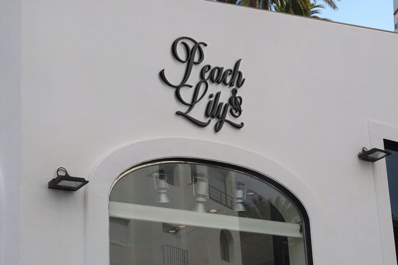
For my Peach & Lily redesign, I explored multiple logo iterations, each showcasing different styles and fonts to emphasize distinct brand approaches.
Through this process, I refined the visual identity to align with the brand’s shift toward elegance and sophistication.
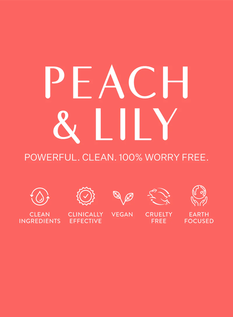
The final logo and color palette balance vibrance and refinement, creating an inviting aesthetic that appeals to consumers of all ages while staying true to the brand’s values.
Key words to measure the logo: Clean | Authenticity | Delightfulness | Safe | Elegancy


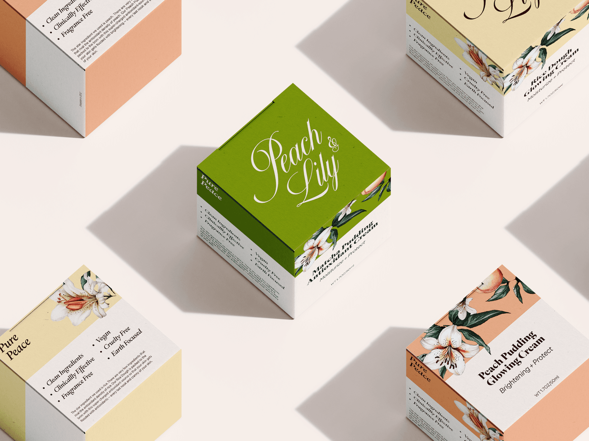
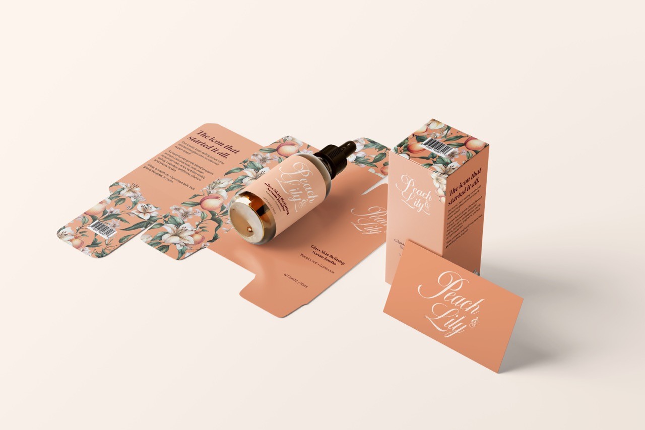
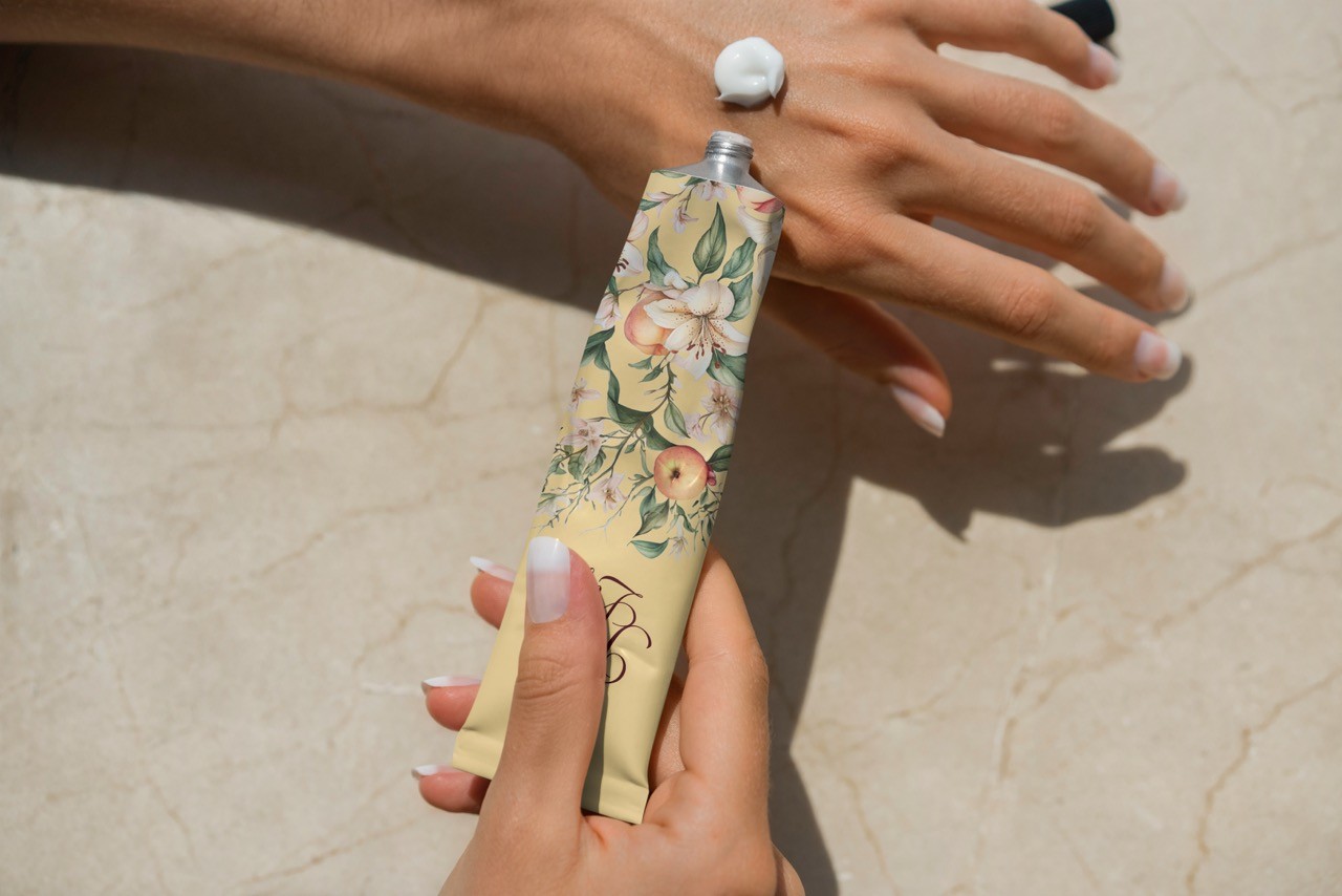
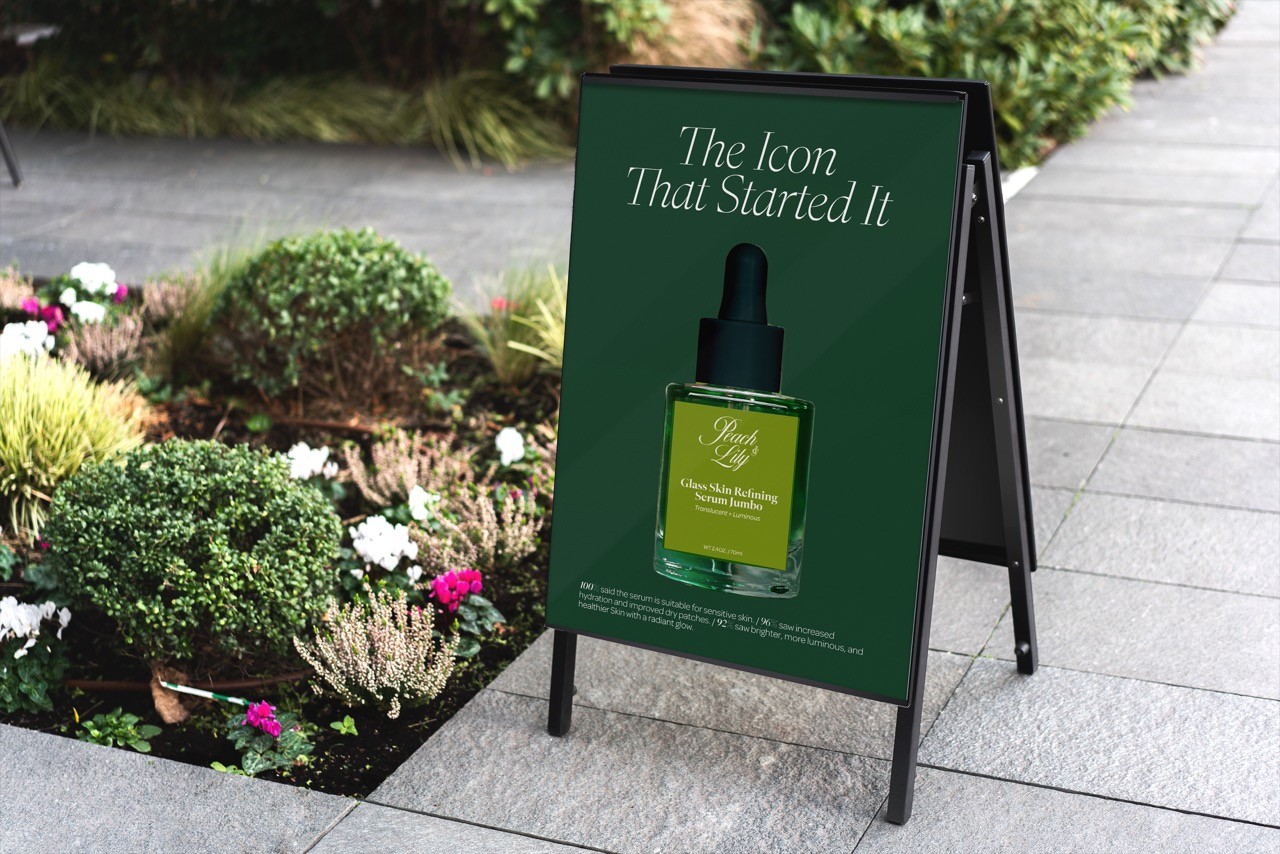
Execution

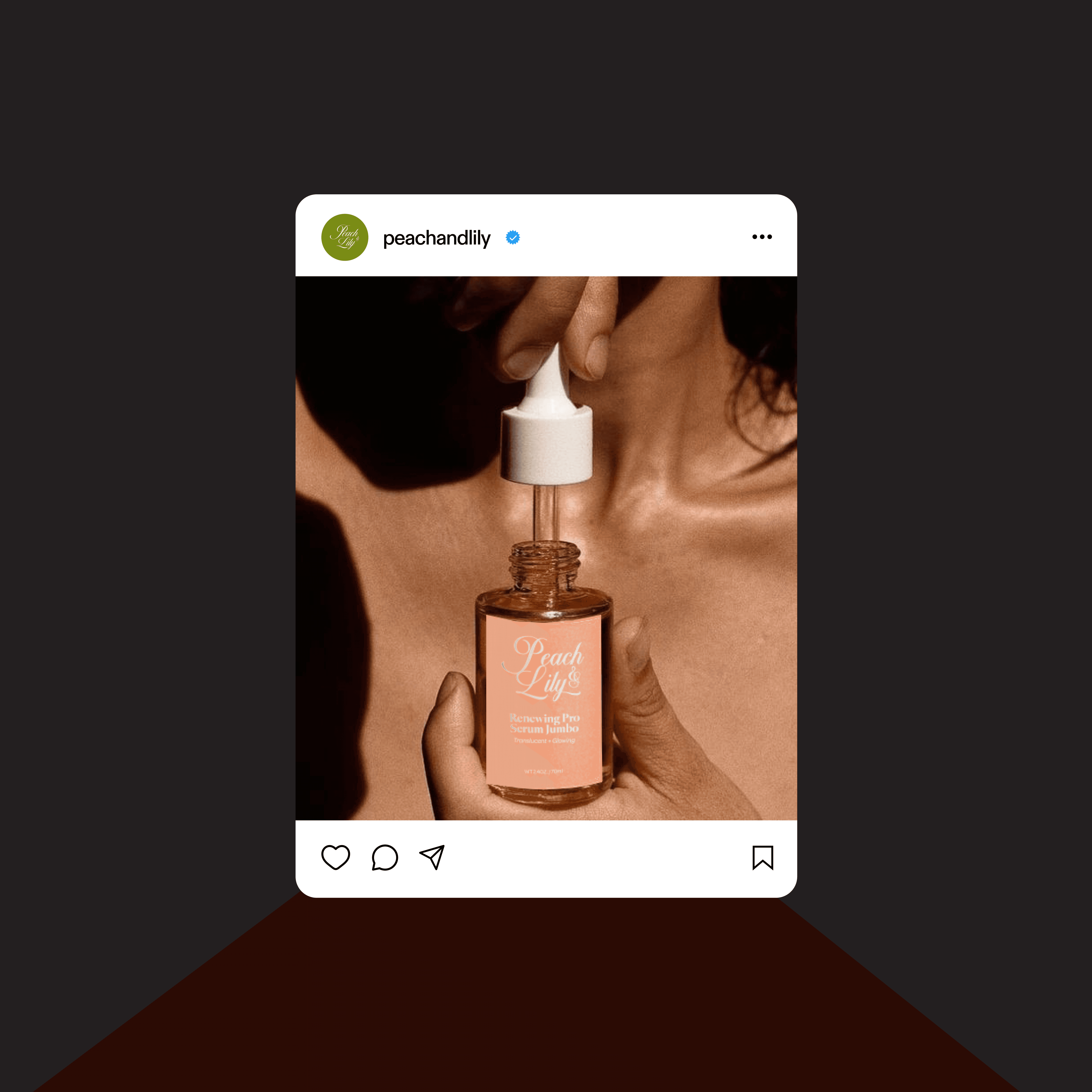
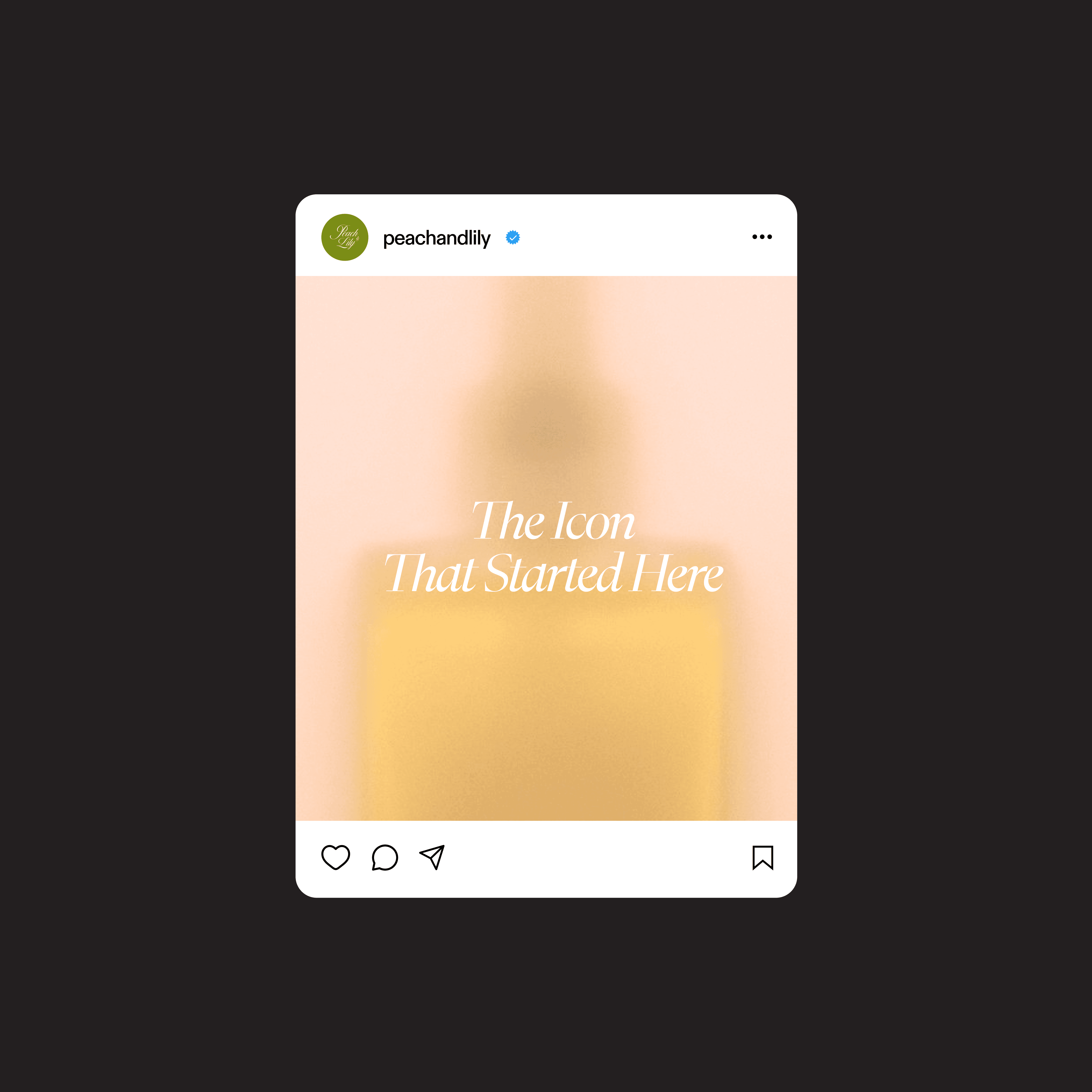
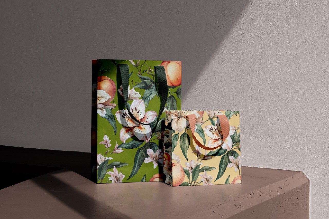
Watercolor illustrations for Peach & Lily were created in Midjourney to evoke elegance and strengthen the brand identity.
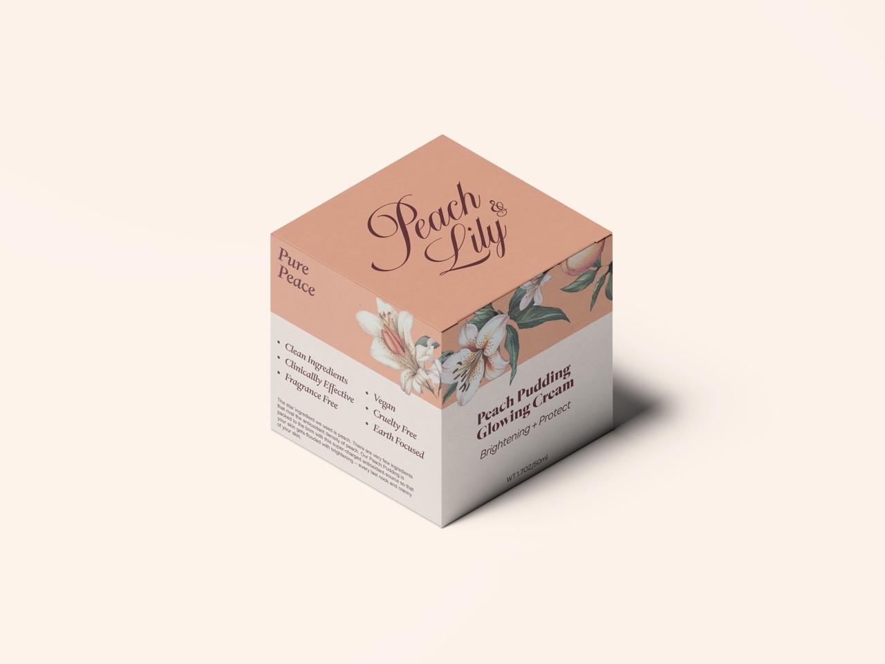
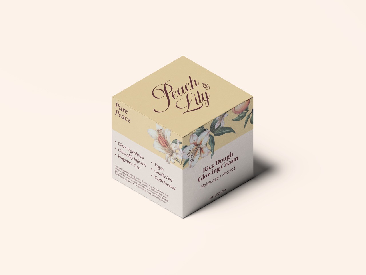
Colors were carefully chosen to be vibrant yet pastel, appealing to both a younger audience and the existing middle-aged demographic.
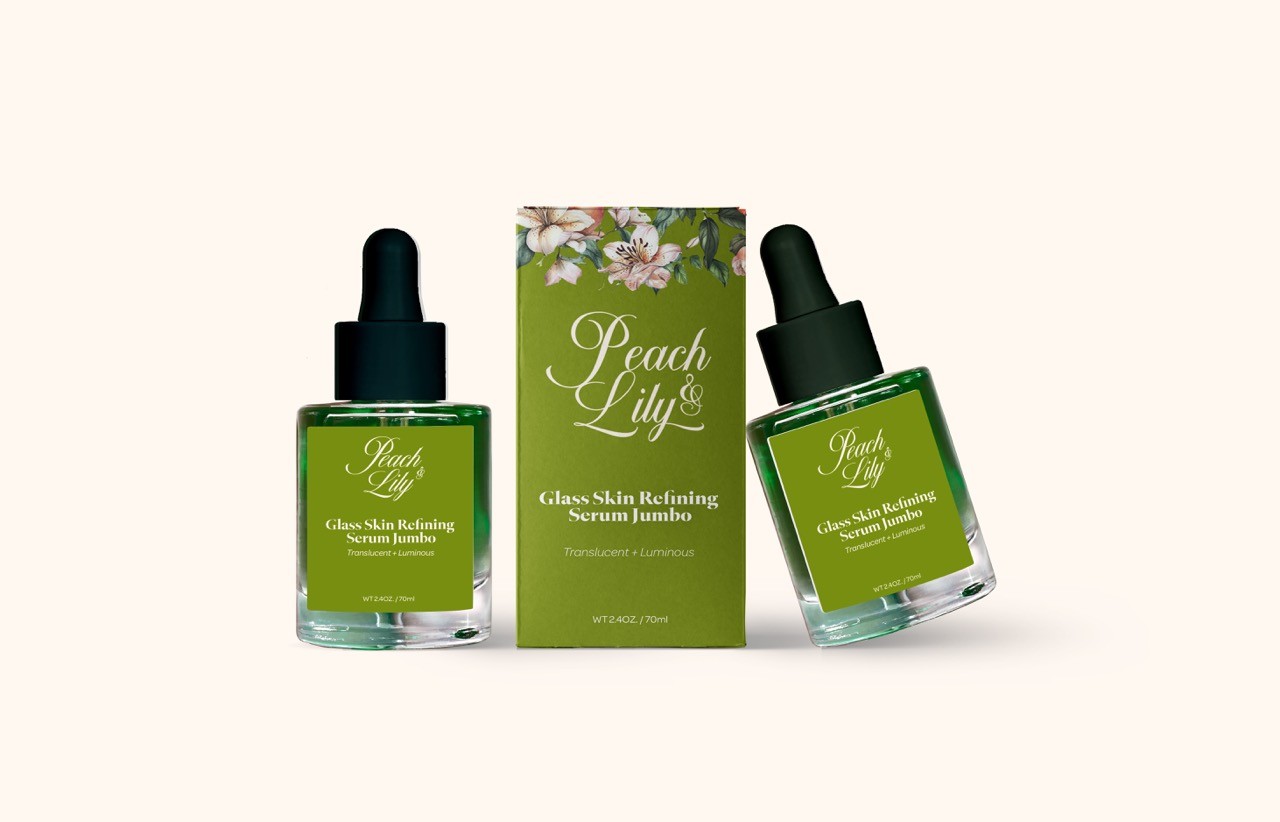
Using San Serif ( ABC Grammercy) and Display ( Nautica) to create the elegant and delightful look.

View Next Project
