Eth Tech | Job Searching

Haitouwang is a job-searching platform built to help international students navigate the U.S. job market more smoothly. As a Product Design Intern during my junior year, I designed an end-to-end responsive platform by creating wireframes, high-fidelity prototypes, and interaction flows. I developed generative AI–powered job application features that boosted user conversion rates by 12%, and conducted usability testing to identify pain points, driving iterative improvements to the overall experience.
Industry
Job Searching
Time
Sep 2023 - Apr 2024
My Role
UX Designer
Tools
Figma
Google Doc
Skillset
Project Development
UI/ UX Design
User Research
Competitor Analysis

01
Designed and delivered a responsive end-to-end job-hunting platform for international students, creating wireframes, high-fidelity prototypes, and interaction flows that streamlined the application experience.
02
Built generative AI–powered job application features that boosted user conversion rates by 12%, collaborating closely with engineers and PMs to align design with technical feasibility.
03
Conducted usability testing and analyzed user feedback to identify pain points, then iterated on designs to enhance usability and create a smoother, more supportive job-search journey.
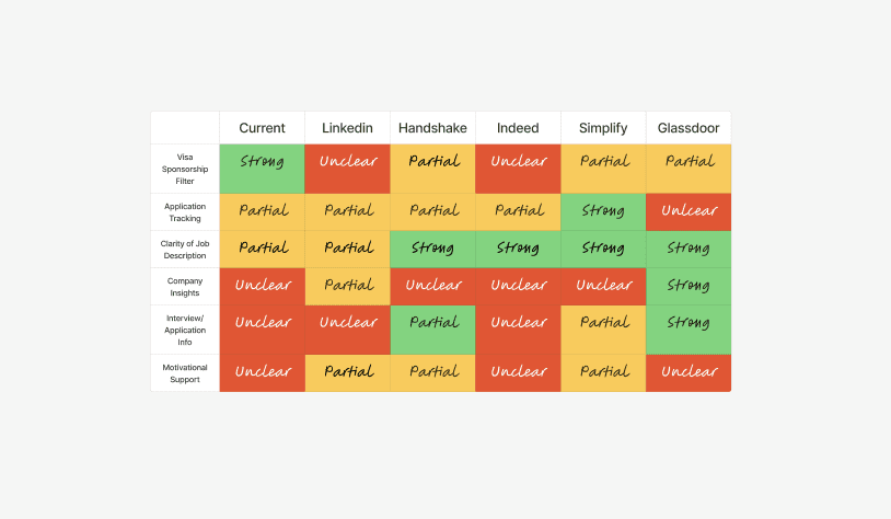
The lack of clear information and guides on job searchings for international students.

Users thought Haitouwang was helpful in providing the information of sponsorships. However, the function in the website is limited to provide further guidance and resources, resulting in a drop retention on Haitouwang platform.
Inspirational Search & Competitor Analysis

User Interview
To better understand the current pain points of users, I conducted a series of interviews with the internal execute search headhunters to gain insight into the scope of the obstacles that they faced.
The interviews were structured around several key sections designed to provide a detailed understanding of users' experiences in the progress of finding the best fit candidate.

Personas


Opportunities to imporve
Before
Streamline process for users to navigate and click in the job description.
During
Make the application process feel effortless and guided with simplicity.
After
Provide a smooth and holistic experience after job application.
lower the churn rate | increase application number through Haitouwang
Key Metrics

Research & Findings

Iterations


Sponsorship Analysis
When clicking "Read More" under H1B insight, a pop up screen will appear with detailed information and history of sponsorship database such as job title, location, number of people, etc.

AI summary

Jargon Exmplaination
Colored terms indicate key jargon. When users hover over one, a concise definition appears, and all terms transition to colored underlines to maintain a simpler, more cohesive visual flow.

Job Track Board
When users click on an application card, they can edit the dates for each stage. A free space is also provided for taking notes or jotting down to-do lists for every application.
Based on the interviews and insights, I synthesized 2 representative personas to reflect the core users inside an executive search team: the Research Analyst and the Senior Recruiter. Their pain points reveal not only the operational friction caused by scattered communication tools and manual data entry, but also the deeper structural challenges of managing high-volume candidate pipelines with inconsistent systems.
Adaptability
Quickly adapt to shifting directions and tight turnarounds, often reworking designs on short notice. I rapidly learned new user research tools, applied insights in real time, and confidently presented refined concepts to the team under pressure.
Culture Sensitivity in Design
This is a Chinese executive search firm operating in a uniquely Chinese business ecosystem. Cultural sensitivity isn't just "nice to have" — it's critical to product adoption and effectiveness. Constantly reminding myself to design in the Chinese ecosystem and reflect on what the users actually need is important as I design and make changes.