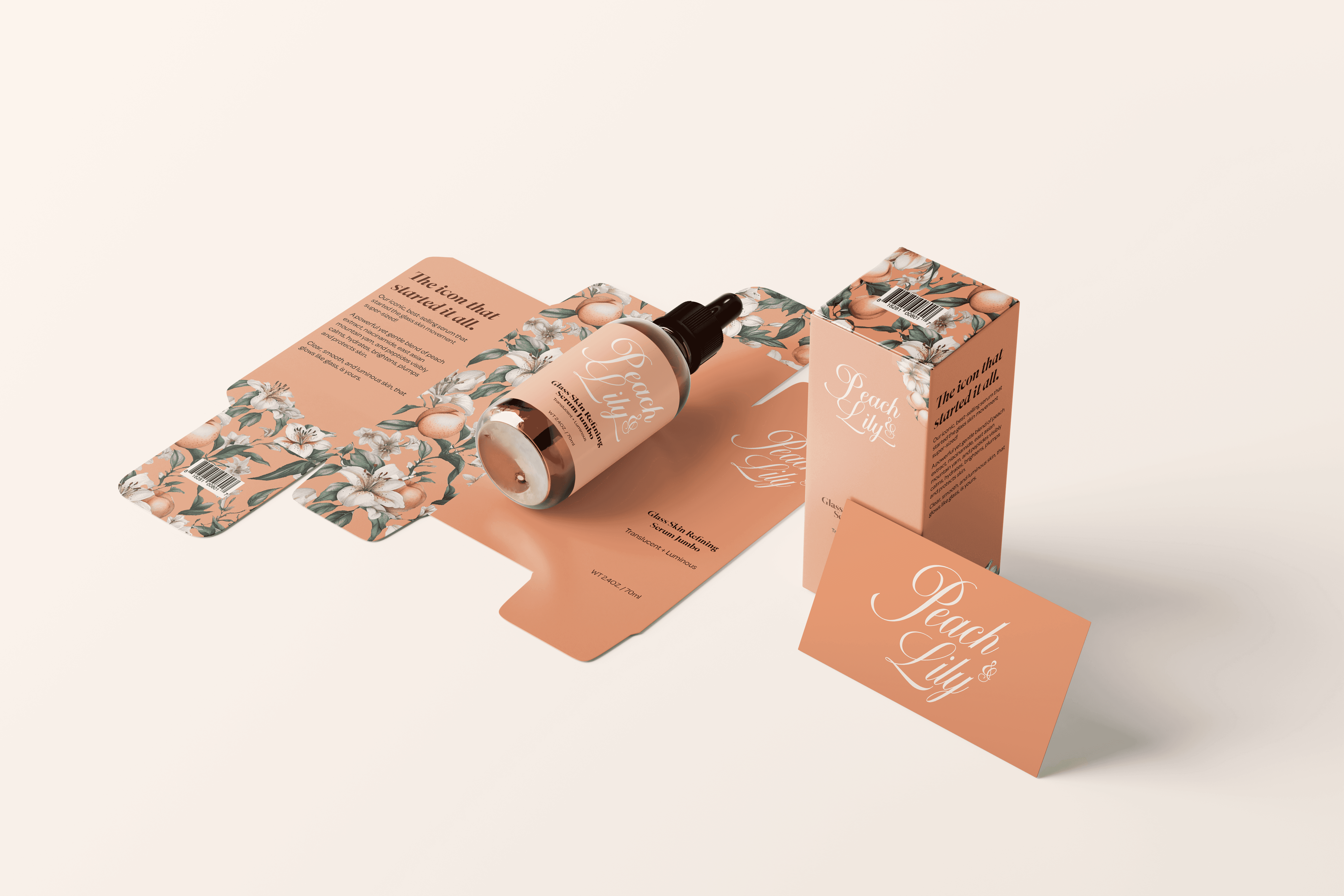
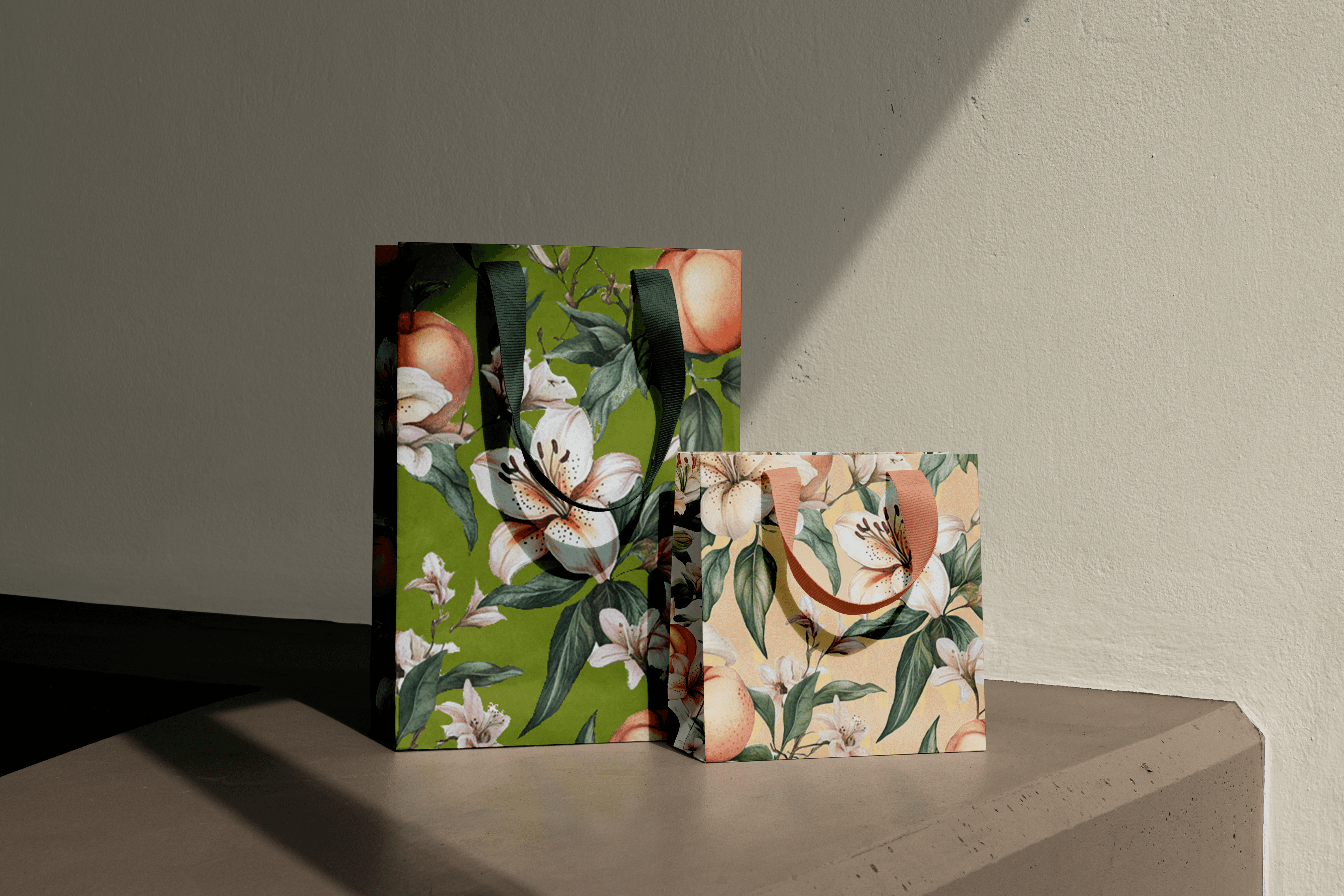
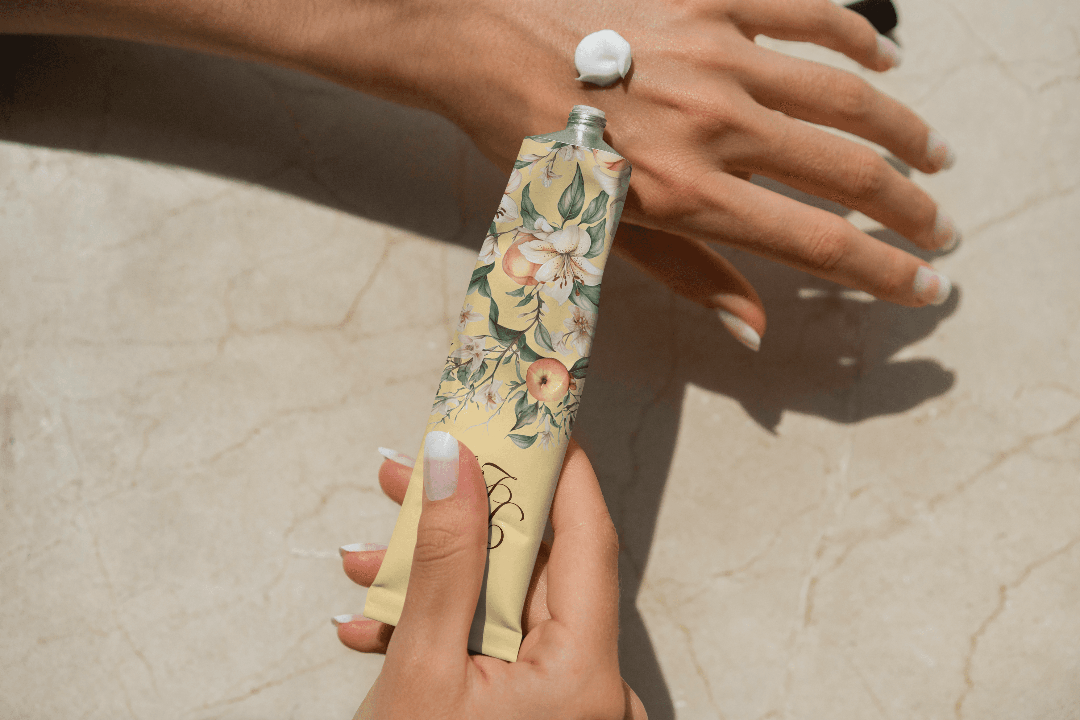
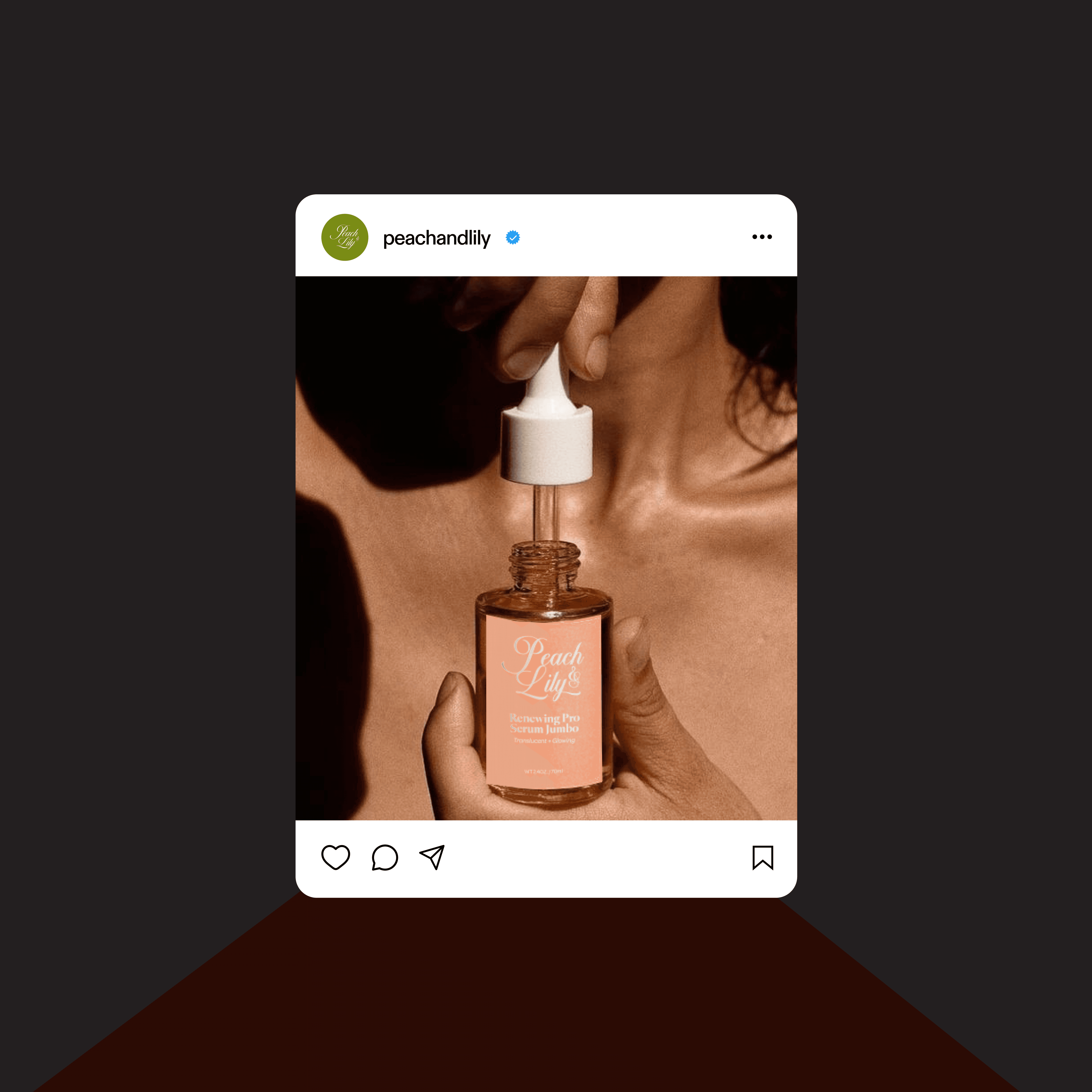
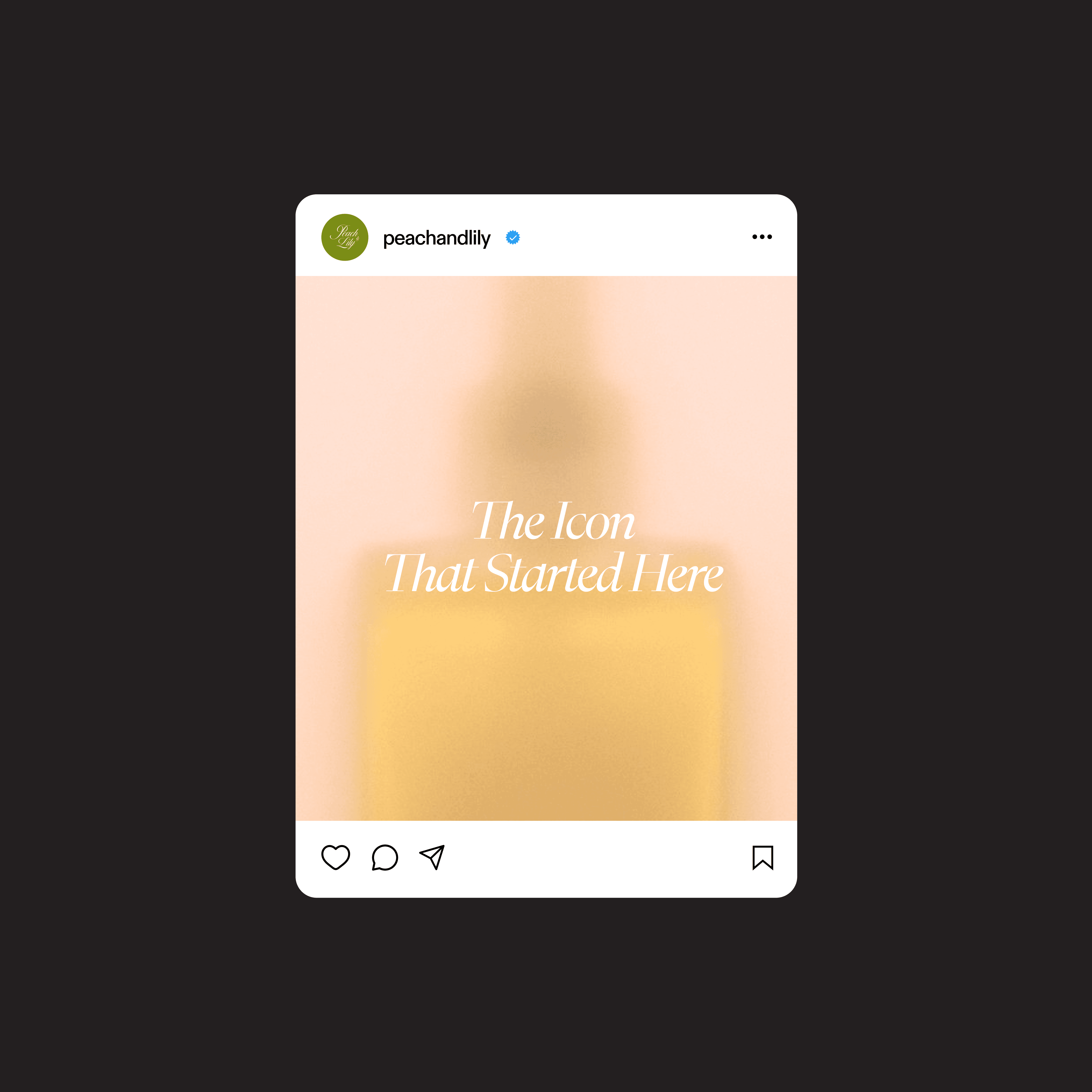
Peach & Lily
Peach & Lily is a pioneer in bringing Korean skincare philosophies to the U.S. market, with a focus on clean, results-driven beauty. This brand design project centers around expressing its core values—transparency, innovation, and gentle efficacy—through a visual identity system that feels fresh, trustworthy, and rooted in wellness. Every design touchpoint, from packaging to digital content, is crafted to reflect the brand’s commitment to natural ingredients, skin-first science, and emotional clarity.

Current Designs
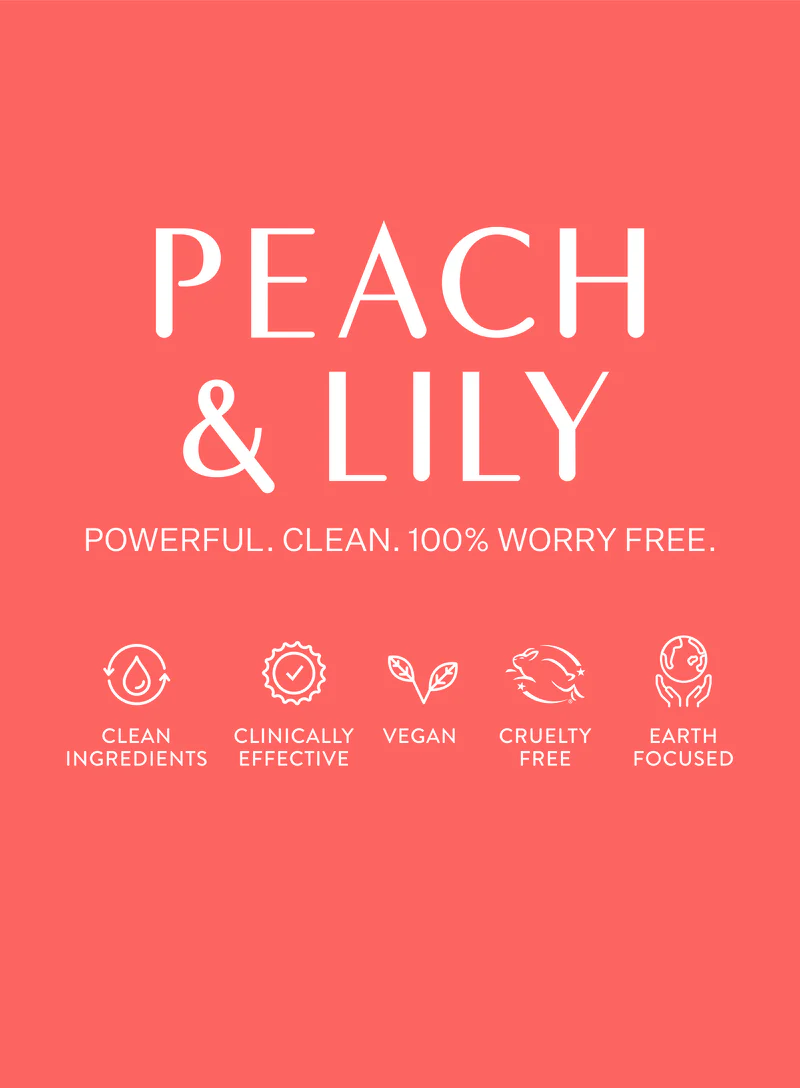
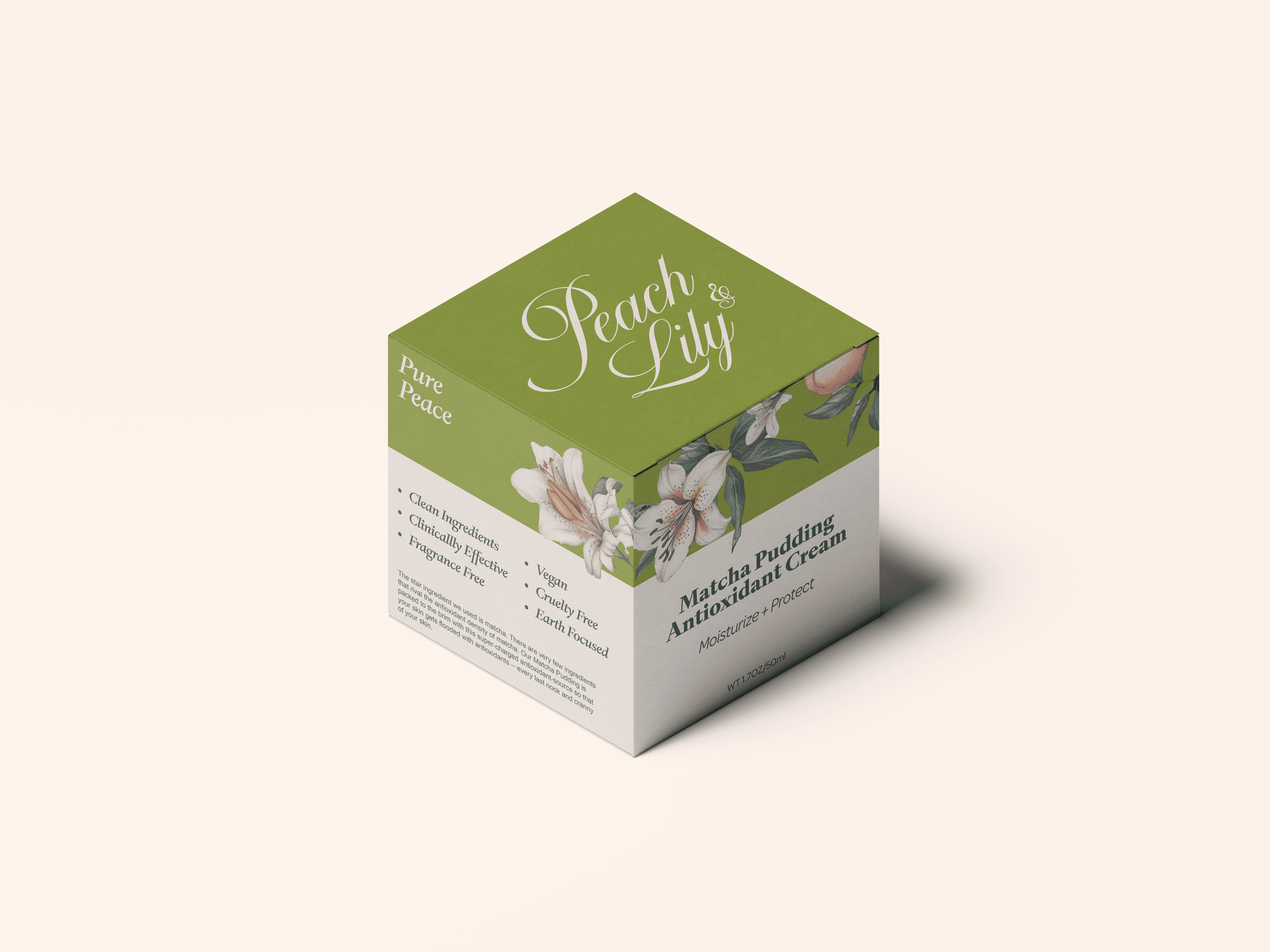
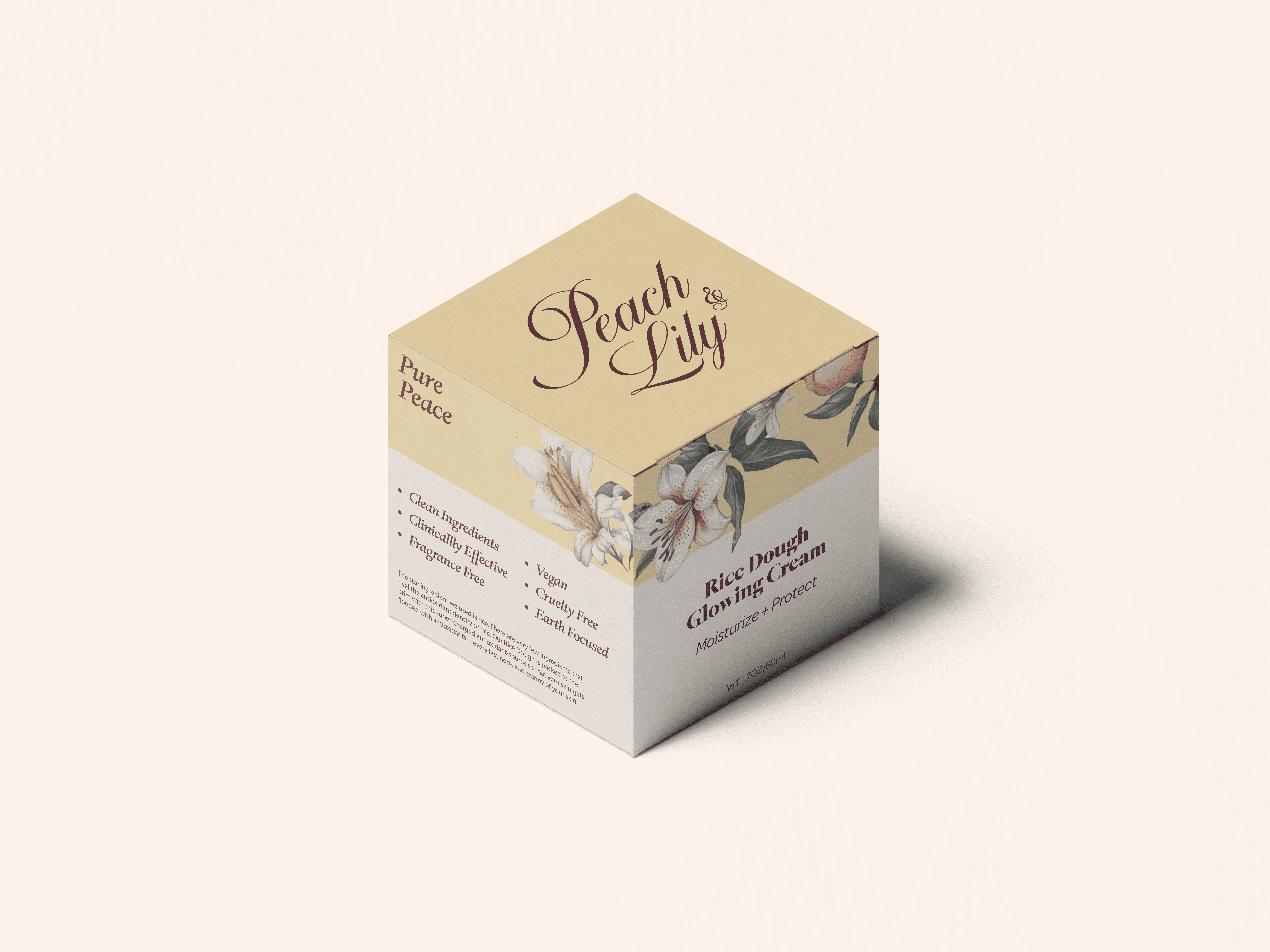
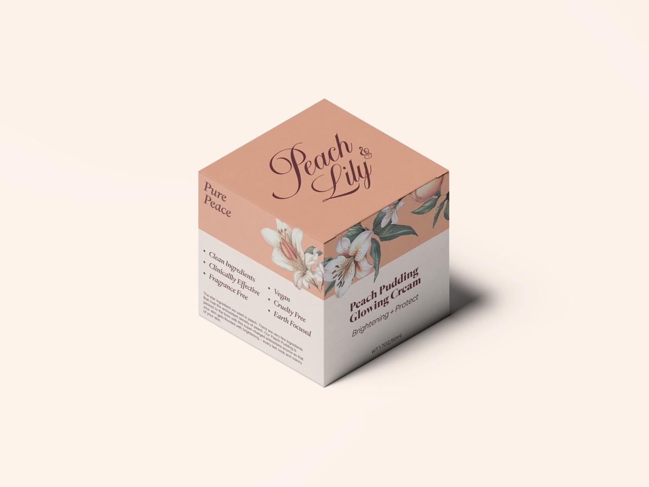
The color palette is overly vibrant, affecting readability and clarity.
The colors chosen do not resonate well with middle-aged consumers.
The designs lack distinctiveness, relying only on color and text variations—requiring consumers to read the text to understand the product.

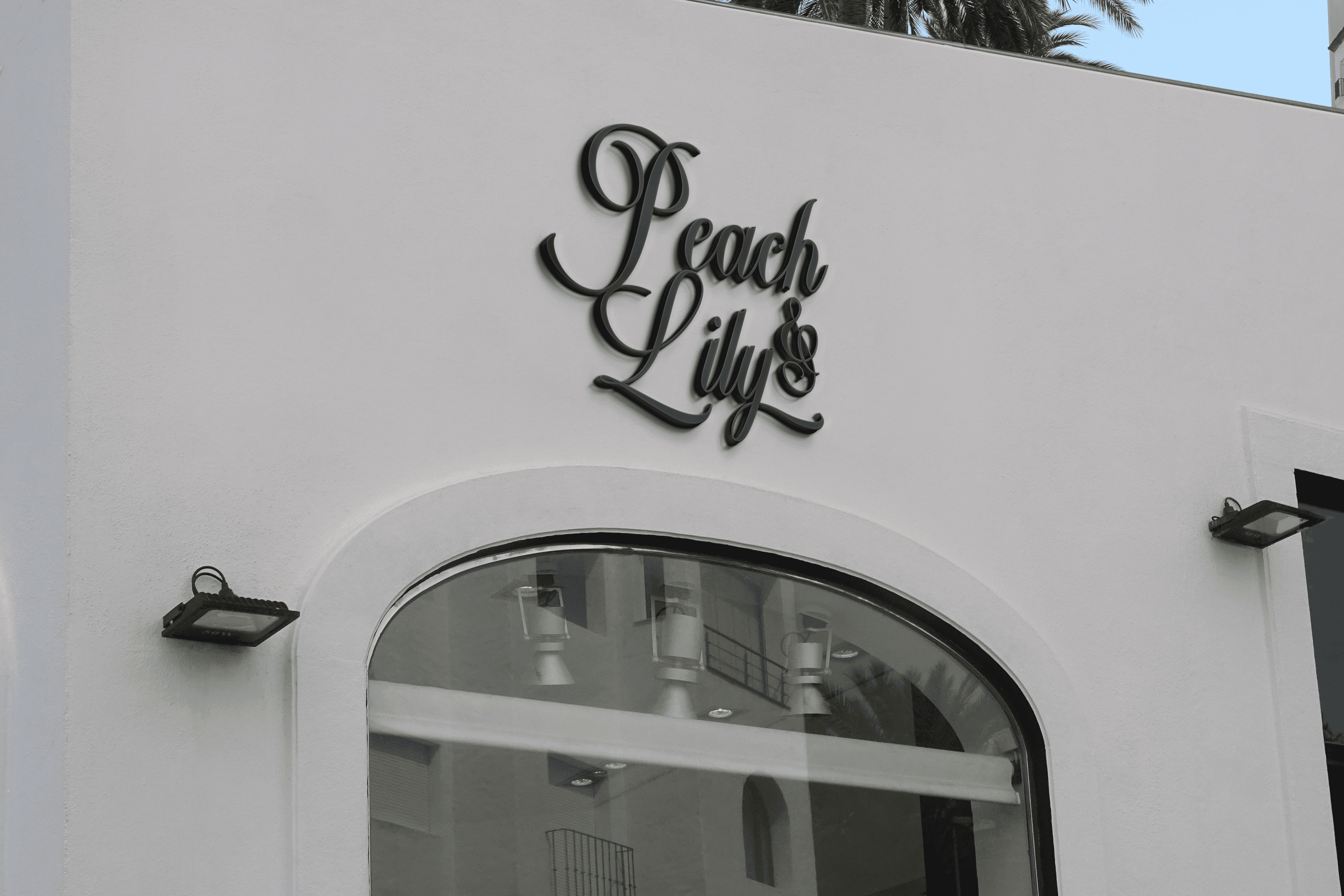
Logo Iteations
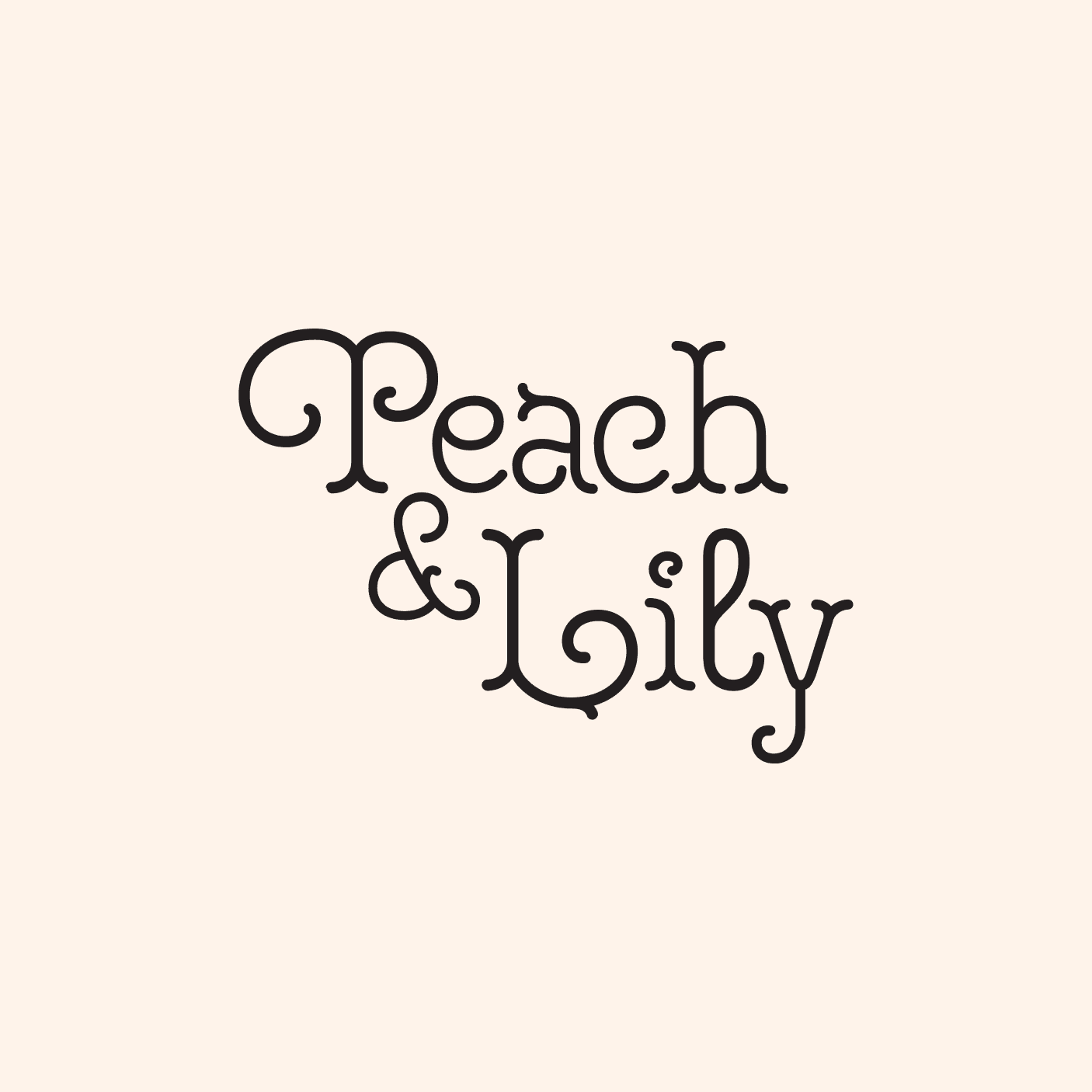
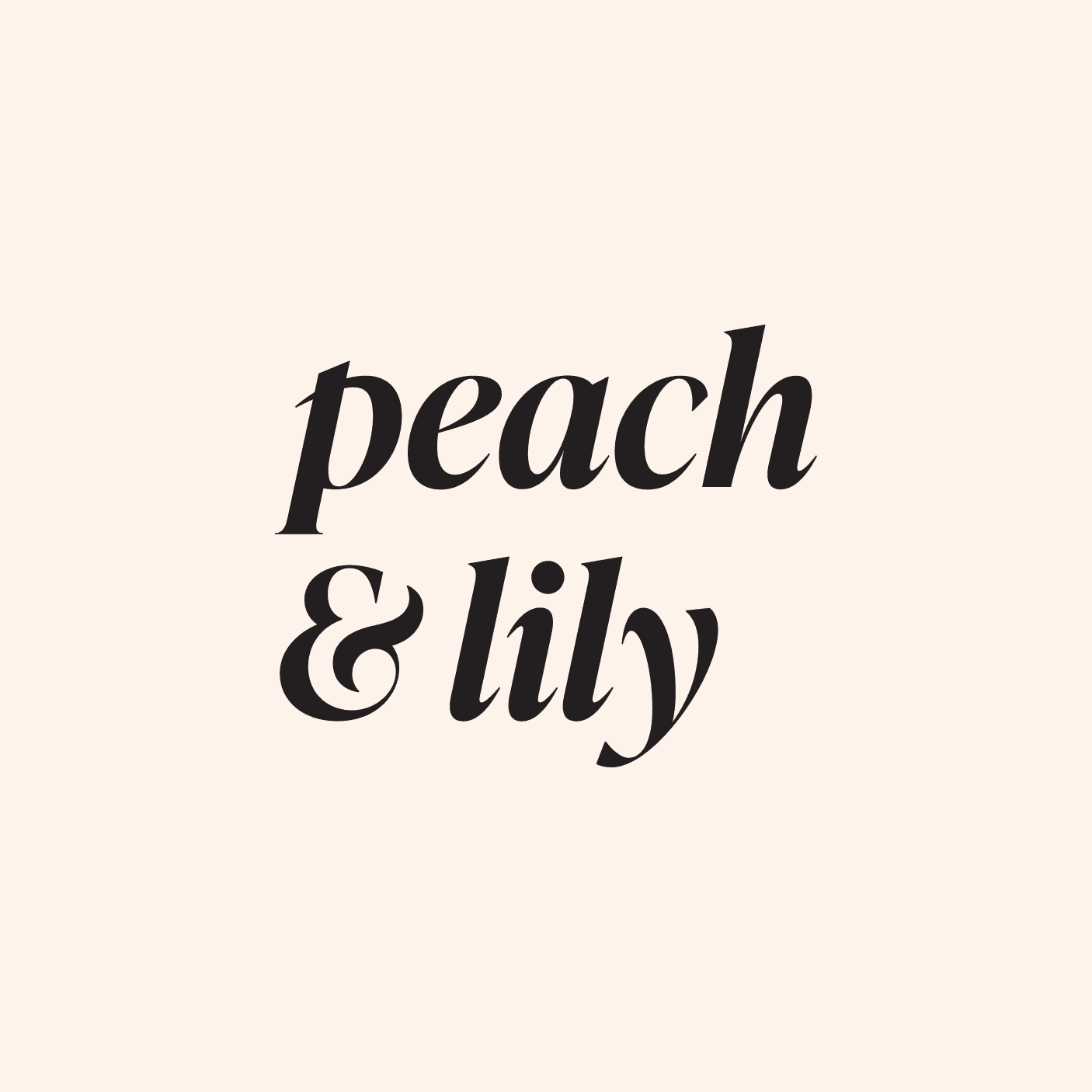
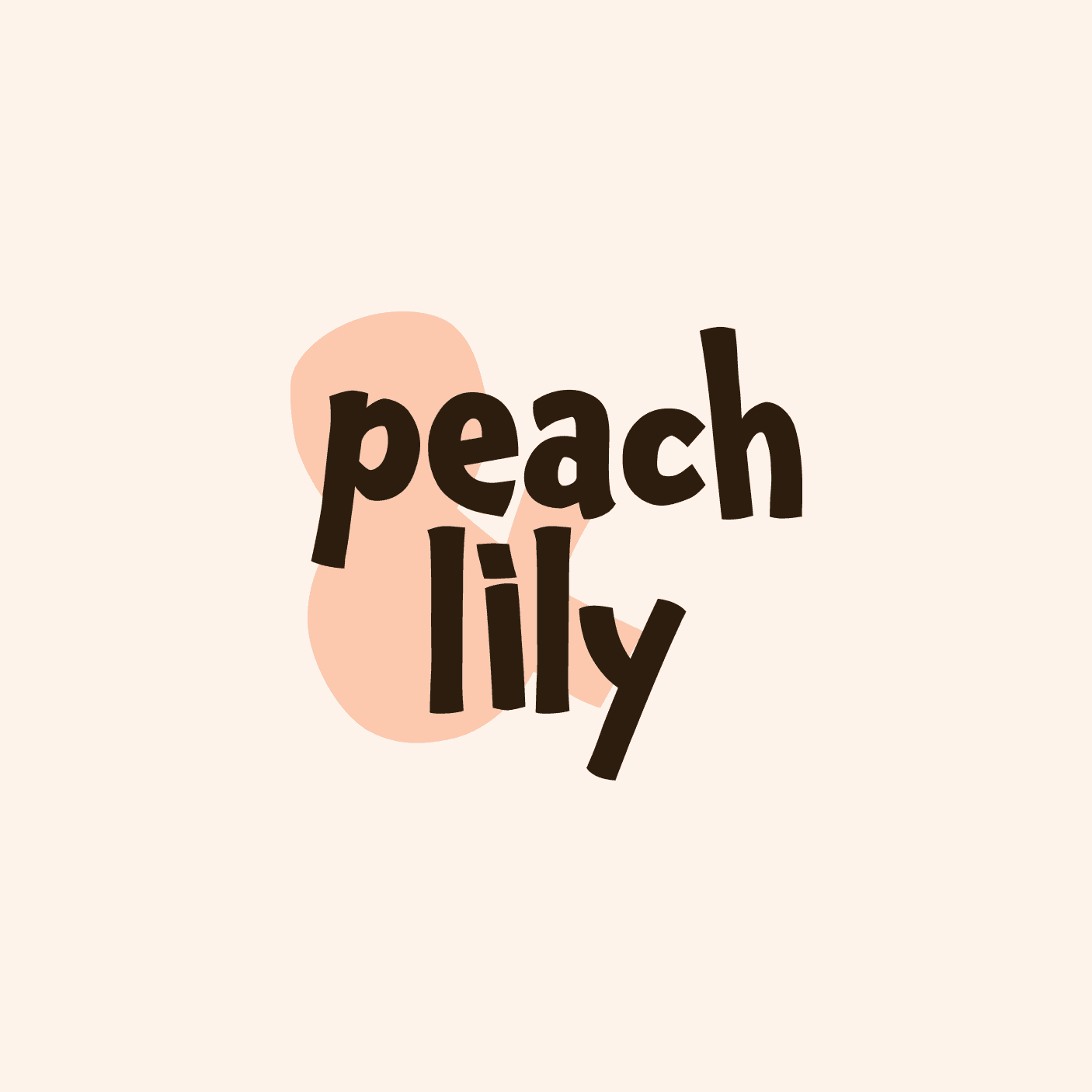
For my Peach & Lily redesign, I explored multiple logo iterations, each showcasing different styles and fonts to emphasize distinct brand approaches.
Through this process, I refined the visual identity to align with the brand’s shift toward elegance and sophistication.
The final logo and color palette balance vibrance and refinement, creating an inviting aesthetic that appeals to consumers of all ages while staying true to the brand’s values.
Key words to measure the logo: Clean | Authenticity | Delightfulness | Safe | Elegancy


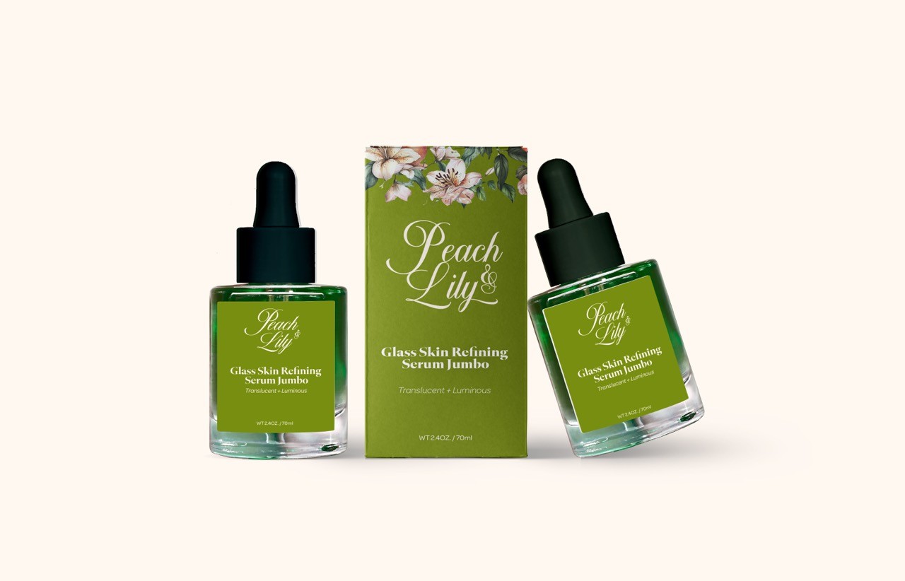
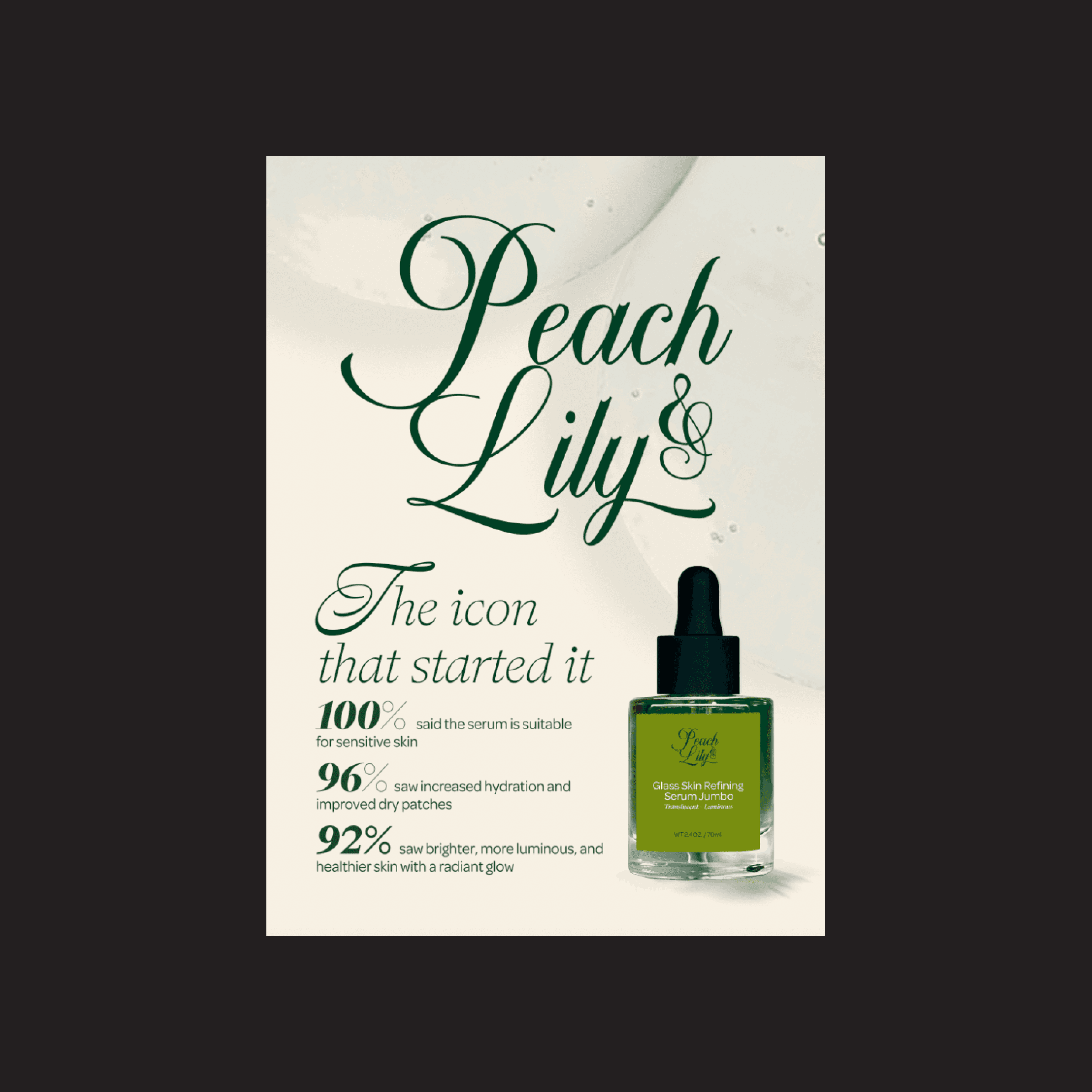


Using San Serif ( ABC Grammercy) and Display ( Nautica) to create the elegant and delightful look.